Monday, 28 November 2011

Typography

The name of my magazine is 'Jam' because it is a term used a lot by musicians and so it would relate to them straight away. This is the font I will be using for the front page:
This was taken from the band 'The Jam' s original logo. At first I was unsure on whether or not to do this because I thought that maybe people would think it was a magazine all about that particular band. But I spoke to my target audience and most of them didn't even really know who the Jam are, let alone know what their logo looks like. Also, the audience that I am aiming for probably wouldn't know about the Jam because they are not around any more and the genre of my magazine is current rock/pop. I therefore decided that it would be acceptable for me to use the logo. This is the original Jam logo for the band...

The font I will be using for the name of the artist on the front cover is from www.dafont.com and is called 'Sex Pistols'. This is what it looks like when I type in the artists name to this font preview on 'dafont':


I have chosen this font because it quite quirky (like the artist is supposed to be) and stands out. I probably will not keep it black however, I will see how it looks on the page and decide what colour I am going to make it. It will probably be a bright colour to stand out against her dark skin and the black dress that she is wearing in the photo I am using. 


Tuesday, 22 November 2011

Photos for front cover


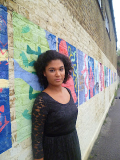
These are some photos that I took during the second photo shoot I did that I thought I could use for the front cover. I like all of these photos and didn't know which one to choose for the front cover so I asked my focus group and the outcome was to use one of these ones...


I have chosen to use the one on the left (the one without the graffiti) because I thought the would take away focus from the model and although I could have photoshopped the graffiti out of the picture, I much prefer her facial expression and pose in the other one. She is very slightly smiling whereas in the other one she looks too moody. 


Wednesday, 16 November 2011

Semantic Fields

The genre of my music magazine is indie rock / pop. Here is a list of words that belong to the semantic field of this genre...

 - pop
 - indie
 - rock
 - techno
 - beat
 - rhythm
 - hot
 - fresh
 - edgy
 - loud

I will use some of these words and other associated language throughout my magazine to create a connection with the readers.

Intertextuality

In my magazine, and in my article, I will use certain references to connect with the reader and also for them to connect with the artist.


The artist...
Favourite food / restaurant: Nandos
Favourite film: School of Rock
Favourite bands / influences: Blondie, The Noisettes, MGMT, Florence & The Machine
Favourite place to be: London
Favourite place to shop: Urban Outfitters and Camden
Other interests: Fashion, film, ice-skating, dancing, traveling, also maybe an interest in tattoos?


To connect with the reader, references to things in popular culture will be made, for example...
Clothing and brands
Urban outfitters
Topshop and Topman
Nike


Tuesday, 1 November 2011

First Photoshoot

Here are a few of the photos that I was pleased with from the photo shoot. I would have to edit these before I was totally satisfied with them, because some of them need cropping, and also I don't like the back ground. So if I was to use any of these, I would cut Tyra out from the photos. I need to do at least one more photo shoot in a different location. 

If I was going to use one of these photos, there is quite a lot I would need to edit before they were useable. I have edited one of the photos a little bit just to show the kind of thing I think I would do with the photos.


As you can see, firstly I cropped the image so that the black bit in the top left corner is gone, and (as I would be cutting her out of the photo anyway if I was going to use it), got rid of the guitar. It may look like I have sharpened the image but I have actually just boosted the colour of it. In my opinion this makes the photo clearer overall. It also makes the bright colours of the dress stand out which makes it eye - catching. 

Flat plans idea for double page spread


Flat plans idea for contents page


Flat plan idea for front cover


Reader Profile

A reader profile is something that is created by the marketing department to show to advertising. It is about their target audience.

Here is the reader profile for my magazine 'JAM'. The two people in the middle are examples of my  target audience, and the pictures around them are all things that they are interested in - this gives potential advertisers an idea of whether or not an advert from their company or brand featured in the magazine would be successful or not.