Sunday, 30 October 2011
Audience Questionnaire
Wednesday, 26 October 2011
Target Audience
My target audience is teenagers and young adults, you could probably class quite a lot of the target audience into the 'indie' sub culture but it is a pop/rock magazine so really it would appeal to a very wide audience as far as sub cultures go.
From my focus group, the average age is seventeen. 50% are male and 50% are female. Common interests are music (obviously), shopping and eating. Looking at my audience profile does provide me with some good information about my target audience but to find out more, I have made this an audience questionnaire. I would ask the questions in the questionnaire to people who fit my target audience and put the results on my reader profile.
From my focus group, the average age is seventeen. 50% are male and 50% are female. Common interests are music (obviously), shopping and eating. Looking at my audience profile does provide me with some good information about my target audience but to find out more, I have made this an audience questionnaire. I would ask the questions in the questionnaire to people who fit my target audience and put the results on my reader profile.
Tuesday, 25 October 2011
Youth sub culture and Music Press history
Youth Subculture
There is no mainstream, there are many 'streams', because culture, especially youth culture is changing all the time and their values and beliefs are always changing. Cultures can be created on the basis of lots of different things, the most common are music, class, and beliefs about / views on life.
Music Press History
For a magazine to be classed as a music magazine, not everything included in it HAS to be music related. For example, politics, philosophy ... obviously the articles would still be in some way relevant to the magazine but they wouldn't just be focused on analysing the music or the artist.
Sunday, 23 October 2011
Thursday, 20 October 2011
Wednesday, 19 October 2011
Youth Subcultures
Definition: a youth based group with distinct styles, behaviours and interests.
The are loads of different subcultures 1960's there were mods, rockers and hippies, and today there are still loads of subcultures such as punks, emos, ravers ect. The study of subcultures consists of the symbolism attached to music, clothing ect. Certain subcultures listen to certain types of music and prefer certain bands. This can sometimes cause opposition between the subcultures.
Record Industry in Crisis
- album sales dropped for 6th year running in 2010
- HMV announced that that it was closing 60 UK stores in twelve months after Christmas sales were down 10%
- growing numbers of illegal downloads and putting music industry under strain
- 76% of the total number of tracks were illegally downloaded in 2010

Tuesday, 18 October 2011


Photo for Front Cover

This is the photo that I am going to use for my front cover. I will crop the photo before I use it so that Bethany is more centred and to make sure it is a medium close up. I have chosen this photo because the magazine is an Autumn term edition, and the sunlight and colour scheme reflect this quite nicely. She is smiling and holding school folders which implies that she is happy to be there. Also I think the setting is nice, in front of the school and all the green in the background fits in with the SHSG colours.
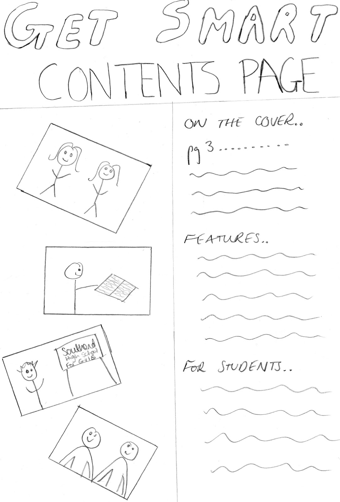
Flat plan of Front Cover

Here is the flat plan for my front cover. I have decided to call my front cover 'Get Smart' because it 'rolls of the tongue' easily and makes the overall tone of the magazine more fun and fresh than 'Achieve'. I will put the website on the front cover, quite near the top, so students can access extra school information easily. I plan to feature an article about the School Birthday on the front cover because that is coming up soon so I think that will be appropriate for an 'Autumn Term' edition of this magazine.
Practice Typography

I am not sure yet whether my magazine will be called 'Achieve' or 'Get Smart'. I think Achieve is a good name for it because it would be an encouraging title. I also like Get Smart because it is catchy and fits in nicely with the idea of a student who has just started sixth form, especially one from another school. I like the idea of the Masthead looking like handwriting because the student will be able to associate with it, and it will give the whole magazine more a casual feel and connect it with the reader more.

What I learned 20/09/2011
Signs and Semiotics
Everything we see is a sign and carries a meaning. A sign is exactly what you see (denotation) and the semiotic is what that sign implies or represents (connotation). For example, a skull and crossbones. The sign is skull and crossbones, and the semiotic could be danger, pirates, death ect. It all depends on the individual and the different ways in which they interpret things. - polysemic
Audience
There is a primary and secondary audience in all aspects of media. The target audience is the primary audience, and the other people that may watch / consume that certain part of media. For example, the primary audience of a health and beauty magazine would be women, but there might be some men who would want to read it too, which is the secondary audience.
Hybrids and Parodies
Every genre has its own specific conventions (ingredients), however sometimes there are a combination of two genres to make a hybrid. A popular example of a hybrid genre is horror and comedy. This has been carried on over the years and now there are the quite well known 'Scary Movies' - these types of films are known as parody films because they are taking the mickey out of other films and putting them into one to make a comedy. Other examples of film parodies are 'epic movie' 'disaster movie' and 'vampires suck'.
Micro and Macro
Within films, there are micro elements, which are very small details in the mise en scene. All of these small details add up to make the macro, and this give the overall feel of the film or television program a more authentic feel .. for example, the program 'Mad Men' is set in the 1950's, so the directors sourced lots of things that genuinely were from the 1950's such as costumes, furniture, even really small details like the fact that everybody used to smoke. All of this adds up to make an overall effect - the macro element.
Tuesday, 4 October 2011
Editing Photos


This is the original photo that I chose to edit. I chose this one because it has good depth of field (the two girls are in focus and the trees and other girl in the back ground is quite blurry), this has a good effect because it brings out the girls and makes them more clear. When editing this photo I firstly sharpened it to make sure that it was totally clear. I then increased the temperature to firstly make it look like it was a really nice day when the photo was taken, and also to give the photo a warmer feel.


The next photo I chose to edit was this one of Emily, I chose this one because I thought it was originally a really nice, flattering picture and so I wanted to see how I could improve it. I turned the photo black and white to make it look more professional, and then I boosted the colour so that it didn't look as dark or boring.
Subscribe to:
Comments (Atom)